How Mapping Arctic Sea Ice Helps Monitor Climate Change
Northern Latitudes is a series examining how maps and mapmaking contribute to our work.
When you think of the Arctic, you probably think of sea ice. That makes sense as it dominates the landscape and helps regulate the global climate by reflecting solar energy and cooling overall temperatures. Sea ice is also an important mode of transportation for northern communities during the fall, winter and spring months.
However, climate change is having an impact on sea ice. This year, the National Snow & Ice Data Center in Boulder, Colorado estimates that Arctic sea ice reached its maximum extent on February 25th, 2022 at 14.88 million square kilometres. This is the tenth-lowest maximum since satellite records began in the late 1970s and it happened two weeks earlier than average. All ten of the lowest maximum extents have occurred since 2006. Equally concerning is that sea ice minimums each September have been shrinking at a rate of 13 per cent per decade.
So, how do we monitor changes in sea ice?
Sea ice goes through seasonal cycles, forming as weather turns colder, growing throughout the winter to its maximum extent and melting in the spring and summer to reach a minimum extent, typically in September. In certain regions, sea ice does survive through the summer melt and is called ‘multi-year’ ice. This ice is harder than younger sea ice and is particularly hazardous to ships.
There are two ways of studying sea ice: remotely and in the field. Sea ice covers very large areas in places that are difficult for southern researchers to reach, which made studying it very difficult until the launch of satellite-based sensors in the late 1970s. Sensors on satellites are used to monitor sea ice extent and movement year-round and are crucial for providing ship operators with navigational information in ice-covered areas.
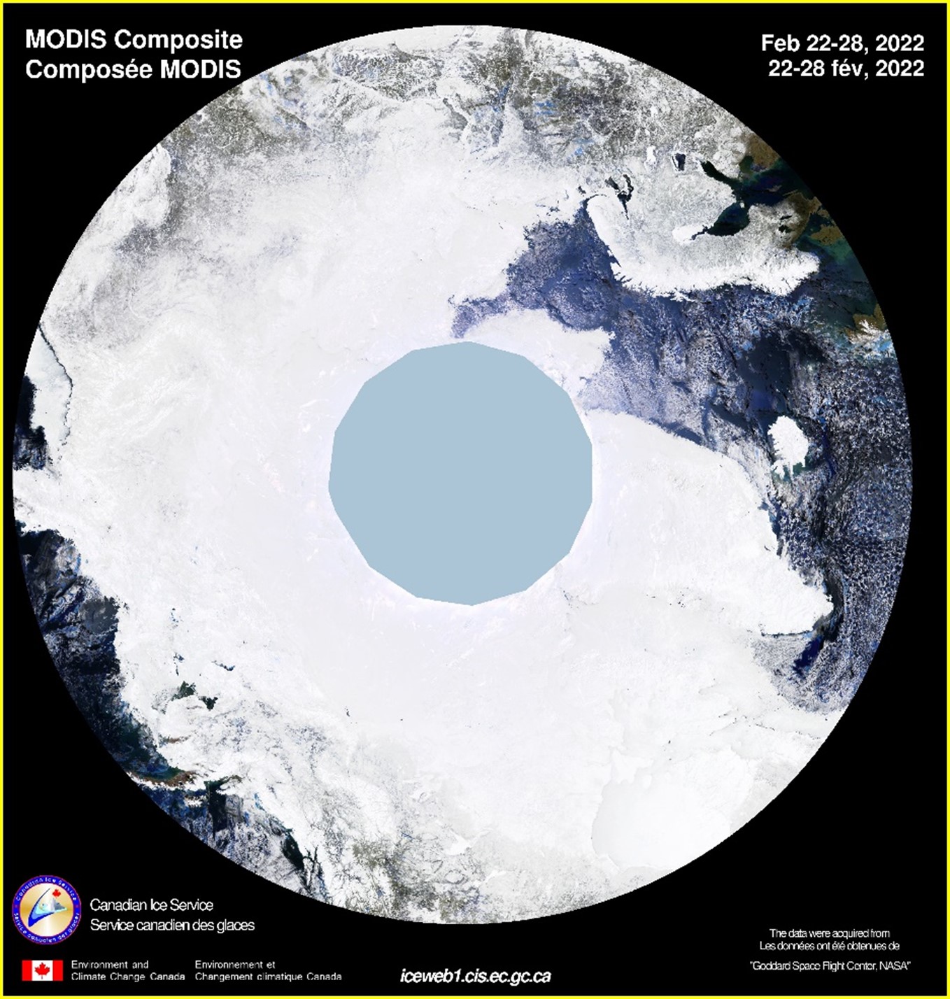
Different types of satellite sensors use different wavelengths of electromagnetic radiation to capture images. Those that use wavelengths in the visible spectrum produce optical images such as Map 1 below, which is a composite image. However, these images depend on sunlight and clear skies, which are limited during the dark months of an Arctic winter. The blue circle in the middle of Map 1 represents where light was insufficient to take an image. As well, cloud cover and snow on the sea ice means these images are sometimes difficult to interpret.
Map 1: MODIS Imagery Composite from the Canadian Ice Service
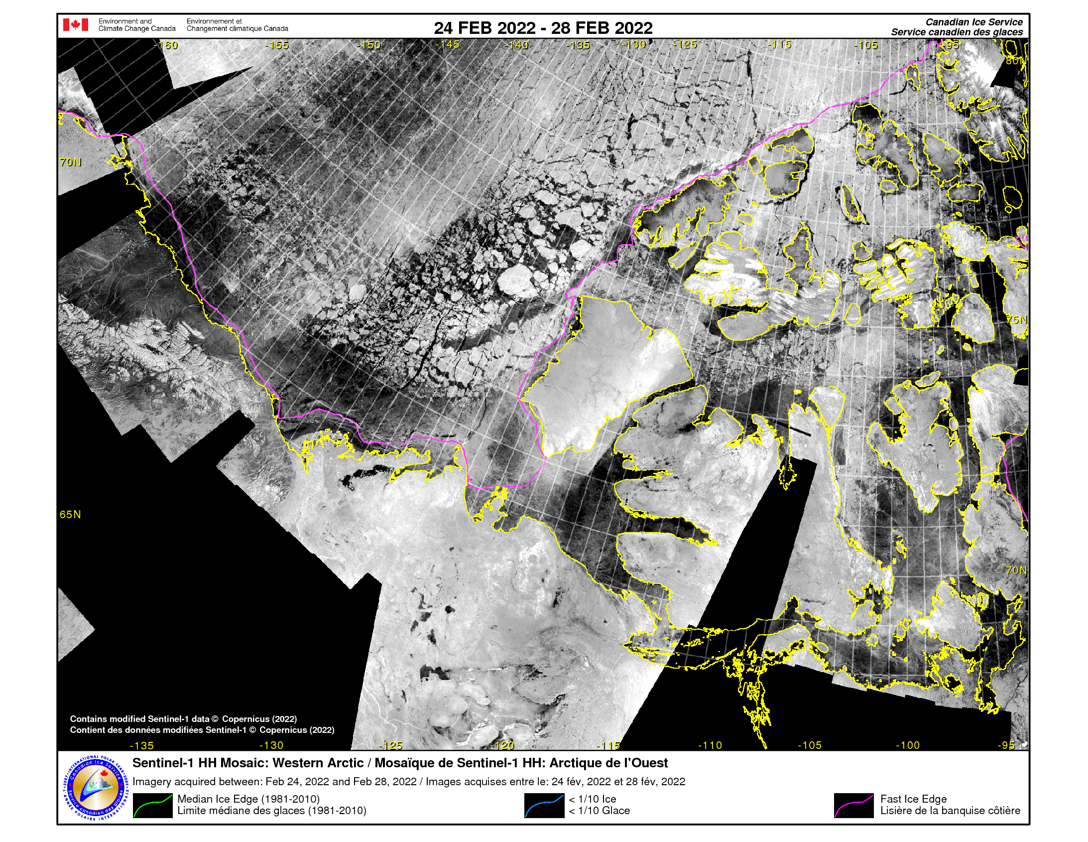
Sensors using longer wave radiation aren’t dependent on light or impeded by clouds and can provide more information about sea ice texture and salinity. For example, Map 2 is a mosaic of images from the Western Arctic gathered by a pair of satellites called Sentinel-1 launched by the European Space Agency. It shows the sea ice at its maximum this year.
Map 2: Sentinel-1 imagery Composite from the Canadian Ice Service
Another way to monitor sea ice is “in situ,” which means going out in person to measure its thickness, salinity and temperature. Data about sea ice thickness is often gathered in situ as it is difficult to measure via satellite.
Why study historical sea ice maps?
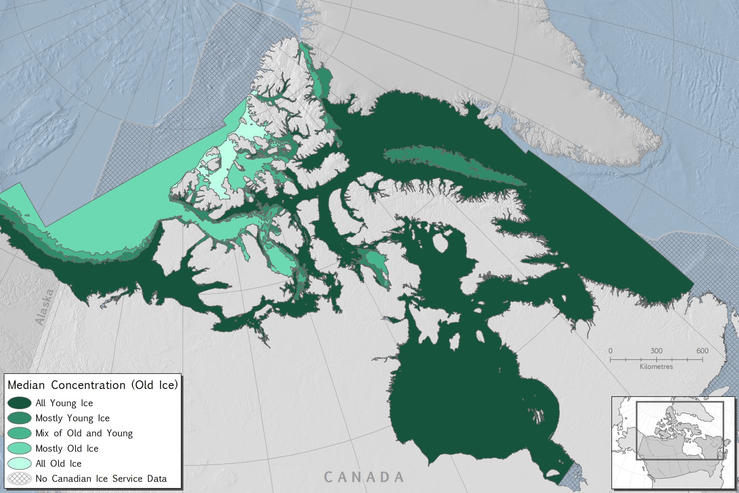
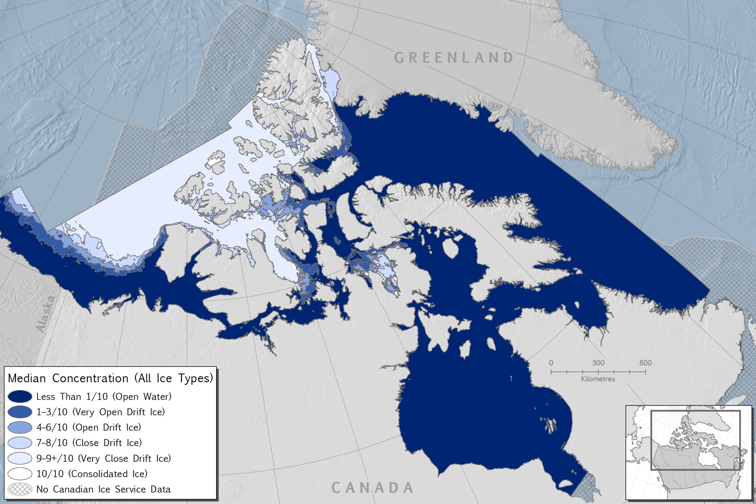
The following three maps from Canada’s Arctic Marine Atlas were based on sea climatology assembled by the Canadian Ice Service using satellite and other data sources between 1981 and 2010. A climatology is a long-term record of measurements and observations for a particular area that is used to identify trends or abnormal conditions. The maps show the mean sea ice extents during the minimum and maximums, as well as the appearance of “old ice” (over a year old) in the Canadian Arctic.
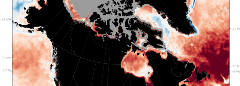
Sea ice scientists measure ice in fractions – imagine if you applied a grid to the ocean’s surface, and within each grid cell you determined the proportion of the ocean that was covered by ice. That is how the ice concentrations are calculated. Map 3 shows the median fraction of the sea surface covered by sea ice on March 5th, for the period 1981 to 2010.
Map 3: Median fraction of the sea surface covered by sea ice on March 5 for the period 1981-2010.
In Map 3, you can see that when the sea ice is at its maximum, most of the Canadian Arctic is covered by up to 9/10 concentrations of sea ice.
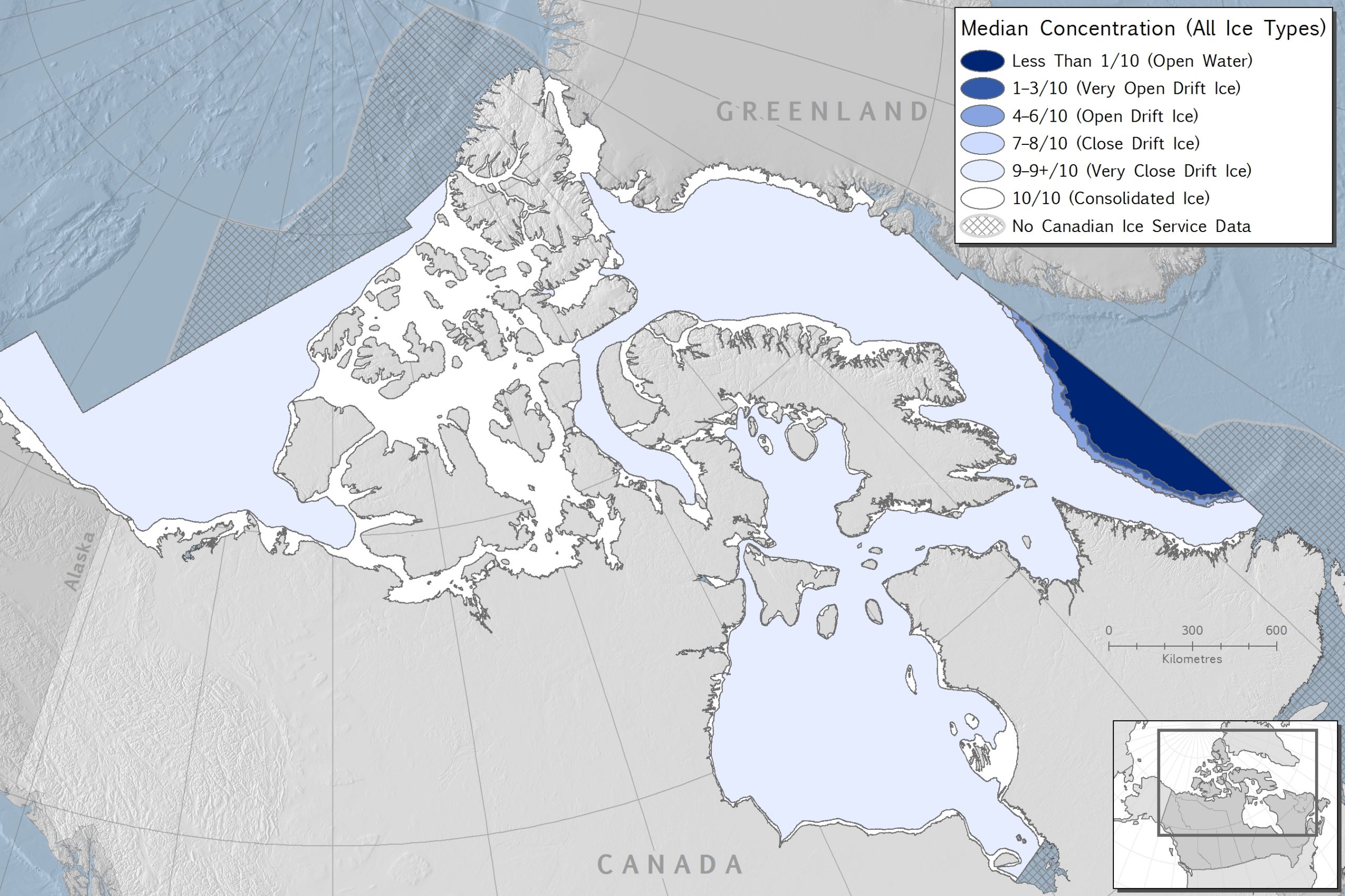
The next map shows the same date of March 5th in 1981-2010, but focuses on median extent of old sea ice. On Map 4, you can see that most of the older sea ice is found in the northwestern Canadian Arctic. That’s caused by the clockwise currents in the Arctic Ocean that push sea ice against these islands, forming some of the thickest sea ice in the Arctic.
Map 4: Median fraction of the sea surface covered by sea ice that is more than a year old on March 5 for the period 1981-2010.
Map 5 shows the sea ice at its minimum in mid-September for the climatology period of 1981 to 2010. By that point, most of the sea ice in the region is gone, except in the northwest, where, if it lasts through the melt, it can be classified as old ice.
Map 5: Median fraction of the sea surface covered by sea Ice on September 17 for the period 1981-2010.
Continuing to monitor and map sea ice extents helps scientists understand where, and how fast, climate change is affecting the Arctic. The ongoing loss of sea ice has large ramifications for northern ecosystems, and the negative impacts of less reliable sea ice conditions are already being felt by Arctic species and communities. This includes the loss of habitat for seals and walruses that use sea ice for resting and breeding, and polar bears who use it for hunting, as well as creating unpredictable and unsafe ice conditions for those who travel across the ice.
OIivia Mussells is lead marine conservation geographer for Oceans North.
Related Content
Ilitariyauyuq: Oceans North
What Do Oceans Have To Do With Climate Change?
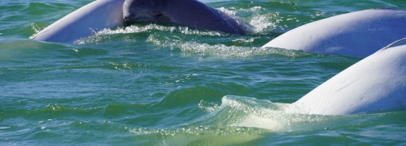
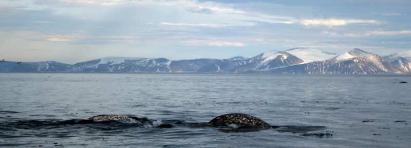
Learn about one of the greatest beluga migrations in the world.
Ilitariyauyuq: Paul Labun
New Podcast Explores How To Protect Our Oceans
Introducing Canada’s Arctic Marine Atlas